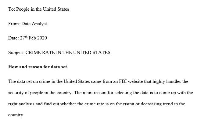
How you selected which data to visualize and why you visualized it in the form you did
NOTE: I chose ( Crime in the US)
The final visual report you create will include the three visuals you have made and the supporting text necessary to explain the data you have visualized and make your point.
In addition to the visual report, you also will create a second deliverable: a reflective memo of about 250-500 words. this reflective memo will explain your choices and goals and how the visual report deliverable achieves them.
For this project, you will select a data set from the ones listed below and create a short (approximately two-page) informational report that includes at least three data visualizations that you create and that you feel best communicates the data you select from your data set in a form that maximizes the impact of the data to suit a specific audience and purpose.
To create your visualizations and informational report, please select one of the following data sets:
- Pew Trust Core Trends in Technology and the Internet
- Pew Trust Cybersecurity
- Pew Science Trends
- CDC Obesity and Dietary Trends
- CDC Substance Abuse
- Unicef Literacy Rates and Gender
Once you have selected a data set, spend some time with the data. Identify the trends that jump out at you as most significant. As you identify your audience, think about who would want to know about the data and the point you’d like to make. You will not be able to visualize or discuss all the data in your data set. Your job is to select and visualize the data that is most relevant to your audience and the point you are making.
Reflective Analysis – 1 PAGE
A 250-500 word memo that explains the following. Use memo headings to identify each of the topics listed below. Format the memo like a memo.
How and why you selected your data set
How you selected which data to visualize and why you visualized it in the form you did
Who was your target audience and what was your overall goal/purpose
How you ensured that your visualizations of the data were fair, accurate, and clear
A link to the raw data set used to create the report (with a citation for the data)
DATA VISUALIZATION TOOLS
The following tools may be useful in creating your visualizations. There are other tools and apps that you can use, instead. The important thing is to create three original, effective visualizations using the data you have chosen.
(Links to an external site.) (Links to an external site.)Infogram: https://infogram.com (Links to an external site.)
Canva: https://www.canva.com (Links to an external site.)
Piktochart: https://piktochart.com (Links to an external site.)
Easelly: https://www.easel.ly (Links to an external site.)
(Links to an external site.)Microsoft Excel (with minor modifications) makes excellent charts and graphs that can easily be copied and pasted into documents.
Adobe Photoshop or Illustrator (available for students through Adobe Creative Cloud) also have graphics features.
Answer preview to how you selected which data to visualize and why you visualized it in the form you did
APA
315 words


